
Redesigning a Local Museum’s Website for Usability and Accessibility
Menu
The Website Design Process
We redesigned the Clovis Museum website so that all visitors to it, including older adults 65 and over, would be able to access information on it easily and be satisfied using it. We made general design decisions, keeping in mind the reasons people would visit the website:
- to get information to plan a visit to the museum.
- to see if the museum is a place they may want to visit.
- to learn about local history.
- to find out if the museum & historical society has resources to help with their research on local history.
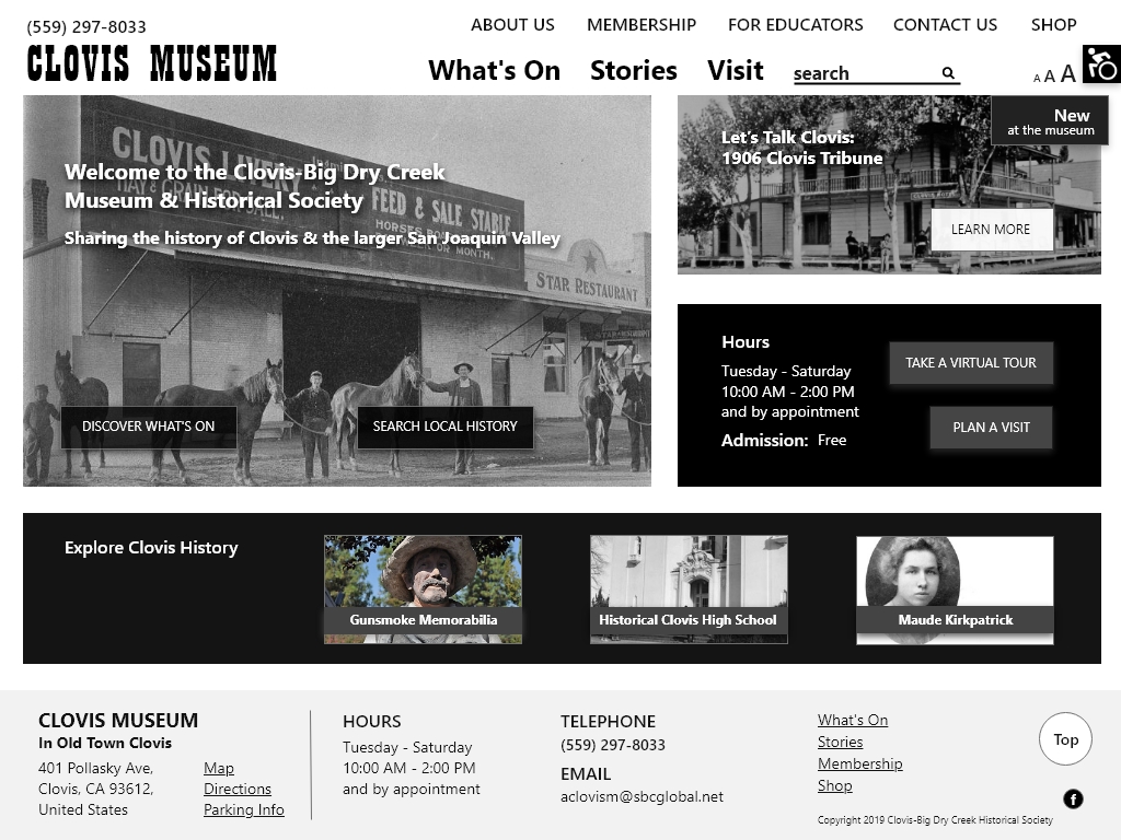
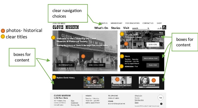
The homepage contents, along with the clear navigation choices, help the visitor know quickly that the website is a) for a local history museum b) that the museum has things going on, and c) local historical information can be searched and browsed. We reached this goal specifically through our design choice of prominently placing historical images, using boxes for different content, clear titles, and few well-delineated navigation choices. (see Figure A).
The difficulties and frustrations older people have when using websites impacted our re-design, and we tried to design our site to be both satisfying and user-friendly for this user group. Designing websites to be user-friendly for older people is similar to designing for people with disabilities (Henry, Abou-Zahra, & Arch, 2009; W3C, 2018)|. This is because many older people have impairments due to ageing that can affect how they use websites. These impairments, as outlined by Kane (2018), Sayago & Blat (2011, p. 360), and W3C (2018), include declining a) vision — reduced colour perception, sensitivity to contrast, and near focus, making it difficult to read online content; b) physical ability — including reduced dexterity, making using a mouse and clicking on small targets challenging, and c) cognitive ability — including “reduced short-term memory, difficulty concentrating, and being easily distracted, making it difficult to follow navigation and complete online tasks” (W3C, 2018).
With these impairments in mind, we analyzed the old site and designed our prototypes while considering the Web Content Accessibility Guidelines (WCAG) 2: (W3C, 2019). Specific recommendations we addressed in our prototype include:
- Adaptability: We added an accessibility plugin so that the web pages' content can be presented in different ways: options are available for hiding images, highlighting links, changing the background colour and font colours.
- Contrast: We have a very high contrast ratio between text and background colour throughout the whole website.
- Resize text: We have prominently placed text resize buttons.
- Titles: Our web pages have titles that describe topics or purposes clearly – they don’t use jargon or misleading words
- Links have purpose and are in context: The purpose of each link can be figured out from only the link text or the link text plus its context. Examples on the home page include “Discover What’s On,” “Search Local History,” “Plan a Visit.”
- Clear links: Buttons or underlined text clearly indicate the links.
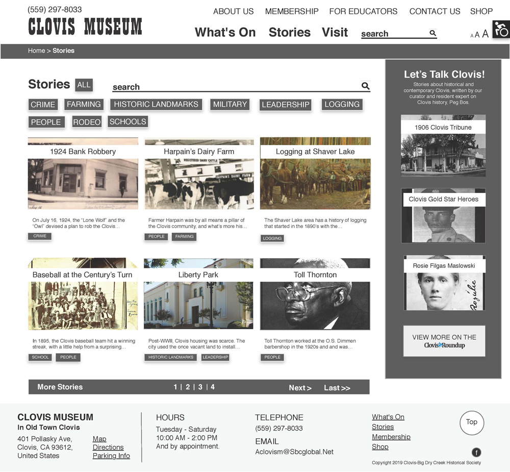
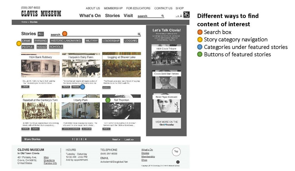
Finding options: We give a lot of different ways for older users to get to pages that interest them. For example, on the Stories page, stories can be searched in the search box, found through clicking on story categories near the top of the page, clicking on categories under the featured stories, or clicking on specific featured stories. (See Figure B). - Clear location: Information about the user's location in the website is displayed because we include breadcrumb navigation on interior web pages (Home > Stories).
We also took steps to design a site that would not be frustrating for seniors to use. In their study on website evaluation for older adults and of ‘senior-friendly’ guidelines, Hart, Chaparro, & Halcomb (2008, p. 197) found that older people’s top complains about poorly designed website were:
- unclear button labels
- confusing names for categories
- too much information to look through
- information overload and cluttered
- hard to get back to homepage
- font too small to read through
- too much scrolling
With these complaints in mind, we simplified and organized the content from the existing site so older users would be less overwhelmed and feel more satisfied using our redesigned website.
Our homepage does not include too much text or too many sections – just four sections – and important information is prominent – hours, phone number, search box, and so on. We also used images to convey what type of website it is without overloading older users with too much content. As well, when using a desktop, laptop or tablet, the Homepage requires no scrolling, and the Stories page requires only a minimal amount to view all the content.
Another way we simplified and organized the existing website contents was by creating the category Stories. By creating this category, we were able to fit the disjointed pieces of historical information and images from the existing website into one place and to sort the contents into meaningful categories. The category names we chose also provide an overview of what sort of history Clovis has had, improving how the website represents the museum and hopefully striking curiosity in visitors to the website.
We also included the option for stories to be browsed and searched for, so that senior users do not have to expend energy trying to figure out the one way to search or browse. See Figure 4. As well, we did not include too many stories on the main Stories page, so that older users would not get overloaded with information and would not have to scroll through a long page. For users who want to browse more through “All” stories, we give this option (see Figure C).

Regarding cognitive impairments and designing for older users, Wagner, Hassanein, & Milena (2014, p. 271-272) point out that older adults suffer from declines in spatial ability, which influences how well they use websites because of increased difficulty in forming accurate mental models. This means older users often get feelings of lostness when navigating web page, as also outlined in Chevalier, Dommes, & Martins (2013, pp. 1011-1012). To help older users accordingly, we kept our site’s navigation simple and shallow – we have just three primary navigation choices (What’s On, Visit) and just five utility navigation choices (About Us, Membership, For Educators, Contact Us, Shop). Also, our navigation does not go deeper than two steps away from the homepage, for example, Home > Stories > Crime. Most content can be found from just one click away from the homepage, helping to prevent older users from feeling lost.
Last, we also improved on the old website by following essential web usability tips, as outlined by Krug (2015), Nielsen (2006), and Wilson (2018). We took advantage of conventions, for example, putting the search box at the top right and the phone number at the top, including the address and contact information in the footer, placing the site name linked to the homepage in the top left. We also broke pages up into clearly defined areas, for example, putting the Let’s Talk Clovis newspaper features in a separate, differently coloured box to the right of the main Stories contents. To eliminate distractions, we left out unnecessary content, including post dates, lengthy introductions to the museum, and meaningless graphics. As well, we formatted content to support scanning by, for example, using clear heading hierarchies, editing down text, and not using long words. Finally, on the interior page, Stories, we provided links in the content area—not just in the top navigation—to get to content elsewhere in the site.
Next Steps
Although we designed our website prototype carefully considering older users’ information needs and accessibility requirements and by applying web usability and accessibility standards, we must follow up with usability testing. Hart, Chaparro, & Halcomb (2008, p 197) emphasize that “an iterative process incorporating both heuristic evaluation and usability testing has been found to be the best practise for designers (Jeffries et al. 1991, Nielsen 1994); as Nielsen (n.d.) suggests ‘each finds usability problems overlooked by the other method’.” With this in mind, our next step will be to do usability testing with a small number of seniors to determine flaws in our design. Finally, we will make changes based on the test findings to ensure our final website is functional and satisfying to use for older adults.
References
Chevalier, A., Dommes, A., & Martins, D. (2013). The effects of ageing and website ergonomic quality on internet information searching. Ageing and Society, 33(6), 1009-1035.
Hart, T. A., Chaparro, B. S., & Halcomb, C. G. (2008). Evaluating websites for older adults: adherence to ‘senior-friendly’ guidelines and end-user performance. Behaviour & Information Technology, 27(3), 191-199.
Henry, S. L., Abou-Zahra, S., & Arch, A. (2009). Older users online: WAI guidelines address older users' web experience. Retrieved October 16, 2019, from W3C Web Accessibility Initiative WAI: https://www.w3.org/WAI/posts/2009/older-users-online
Kane, L. (2018). Usability for seniors: Challenges and changes. Retrieved November 2, 2019, from Nielsen Norman Group: https://www.nngroup.com/articles/usability-for-senior-citizens/
Krug, S. (2014). Don’t make me think, revisited: A common sense approach to web usability (3rd ed.). New Riders.
Nielsen, J. (2006). Prioritizing web usability. Berkeley: New Riders.
Sayago, S., & Blat, J. (2011). An ethnographical study of the accessibility barriers in the everyday interactions of older people with the web. Universal Access in the Information Society, 11(4), 359–371.
W3C. (2018). Older users and web accessibility: Meeting the needs of ageing web users. (S. L. Henry, Editor) Retrieved October 15, 2019, from W3C Web Accessibility Initiative WAI: https://www.w3.org/WAI/older-users/
W3C. (2019). How to Meet WCAG (Quick Reference). Retrieved October 16 2019, from https://www.w3.org/WAI/WCAG21/quickref/?showtechniques=1410
Wagner, N., Hassanein, K., & Milena, H. (2014). The impact of age on website usability. Computers in Human Behavior, 37, 270–282.
Wilson, C. (2018). Web usability: Writing & design. Unpublished manuscript, Loyalist College, Belleville, Ontario, Canada.
The existing Clovis Museum website we re-designed:


Related Activity: Parksville Museum – Website Design
I synthesized Library and Information Science (LIS) literature and applied it in a pragmatic way to information needs during this web-redesign project. I conducted a literature search on web usability and accessibility for older adults (seniors). I included scholarly literature alongside web design, information architecture, and UX industry guides and regulations. I was able to understand and synthesize the findings well enough to explain them in such a way that warmed-up my partner to certain design decisions that countered her archivist perspective. As a result, our design project developed into a webpage that can help seniors access local history information and is user-centred rather than LIS professional-centred.