a stacked bar and line graph

Information visualization – City of Vancouver employees: How do women fare?

Applying information visualization and knowledge translation skills, my partner and I told a story based on City of Vancouver workforce pay rates and gender data. New to information visualization, we both learned data visualization best practices, data cleaning and wrangling, and the InfoVis tool Tableau from scratch to present complex data in an effective and digestible way through our final webpage.


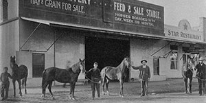
An old photo of Clovis Livery and Feed shop with men and horses in front

Clovis Museum website prototype: A user-friendly website for older people

I designed a website prototype for a local museum in Clovis, California. My co-designer and I identified that seniors were the main visitors to the existing website but that it was terribly user-unfriendly and inaccessible for all users, worse so for older users. After examining UX and Human-Computer Interaction literature on seniors’ difficulties accessing information online, we re-designed the website to be accessible and user-friendly for adults over 65.